

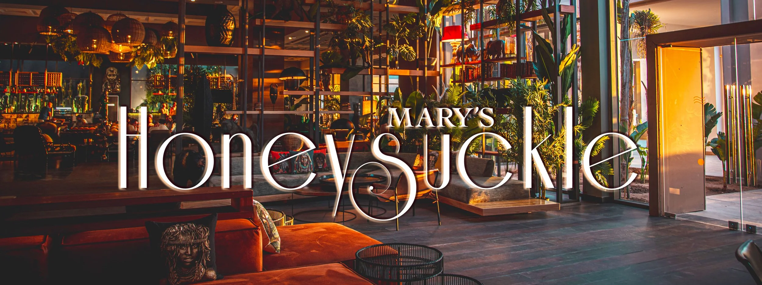
Mary’s Honeysuckle is a tropical Latin-fusion restaurant in the heart of Philadelphia’s Old City. At Mary’s, you can dine on dishes that taste home-cooked while experiencing a lush and lively ambiance. The name “Mary’s Honeysuckle“, comes from a combination of my mother’s name and her favorite flower.
When creating Mary’s Honeysuckle, visions of the tropics and luxury came to mind. The varying line weight of the typeface I chose for my logo contributes to the sophistication I wanted for Mary’s, and the ornamental swirl of the ‘S’ was the perfect amount of drama.
Mary’s Honeysuckle
Dinner menu
For my drink menus, I took inspiration from scientific illustration which heavily influences my design choices.
It was important for the menus to be easily accessible. In the drink menus, the ingredients are showcased clearly to engage customers visually, making them unable to resist ordering a cocktail.
Collateral
Receipts are typically all the same, so Mary’s Honeysuckle receipts are printed with a brand’s floral pattern. This provides another opportunity for customers to connect with the brand and leave an imprint in their mind.
There is an added a signature at the end of the receipt for a homemade touch that matches the down-to-earth nature of the brand.